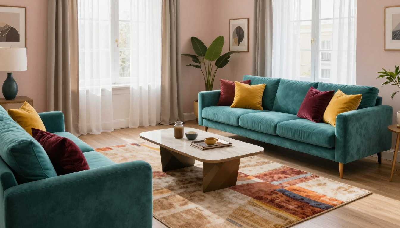
I painted my first apartment bedroom a color called “Sea Salt” because it looked like a calm, dusty blue-green on the sample card. On my actual wall, under my one north-facing window, it read as flat institutional gray — the kind of color you see in a dentist’s waiting room. The color wasn’t wrong. My assumption that a paint chip tells you the truth about your room was wrong. That gap is where most color mistakes happen, and it’s the part beginner guides skip entirely.
The Color Wheel Tells You What’s Possible, Not What Will Actually Work
Knowing that blue and orange sit opposite each other doesn’t tell you that painting one full wall a saturated blue next to an orange sofa will feel like standing in a sports bar. Complementary pairs create real visual energy, but that energy needs a small surface to live on — a pillow, a piece of art — not two large ones competing for the same room.
Temperature matters more than wheel position, and it’s not abstract: a north-facing apartment already runs cool and slightly blue all day. Stack a cool blue paint on top of that light and you don’t get calm, you get cold. I know someone who chased a “spa bedroom” in a north-facing unit with a soft blue-gray and ended up needing a space heater running by November just to make the room feel inhabitable, mentally if not literally.
Choose a Scheme Based on What You’ll Actually Maintain
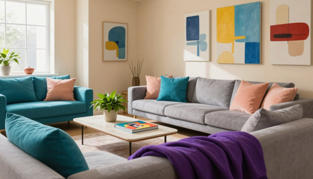
Monochromatic gets called “safe” constantly, and it is — but only with real texture variation. A gray room where the sofa, curtains, and walls are all the same smooth finish looks like a furniture showroom nobody finished decorating. One velvet throw and one raw wood side table in the same gray family fixes this in an afternoon, and it’s the cheapest fix in this entire guide.
Analogous schemes — blue next to teal, say — are the easiest for a first-timer because the colors already share undertones and almost never clash on their own. The failure mode is different: string enough of these slightly-different-but-similar colors across an entire apartment and it stops looking cohesive and starts looking like nobody made a decision, just drifted.
Complementary schemes are the one I’d actually talk most renters out of committing to on a wall. A bold complementary pairing directly on paint means three coats of primer at move-out to get back to landlord-white, and that’s real money and a full Saturday you’re trading for a look you could get from a rug or an accent chair instead — something that leaves with you.
Stop Picking the Fun Color First
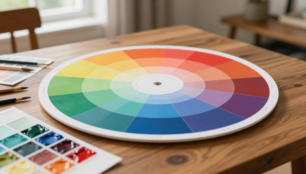
The 60-30-10 rule works, but almost everyone does it backwards: they fall in love with an accent color (a pillow, a print) and then try to force a dominant wall color to match it. Pick the dominant color first, and pick it for how it behaves in your room’s actual light across a full day — not for how well it flatters a pillow you already own. Everything after that gets easier because you’re reacting to something fixed instead of juggling three variables at once.
In a rental, this rule bends anyway. If you can’t paint, your “dominant” is whatever beige or white is already on the wall, whether you chose it or not. Your real job shifts to making the 30% and 10% pull enough weight that the landlord-neutral reads as a deliberate backdrop instead of a placeholder nobody bothered to update.
The Same Paint Can Look Like Two Different Colors Depending on Finish
This one genuinely surprised me the first time I saw it side by side: the same dark green in matte versus satin can look like two separate paint colors once dry. Matte absorbs light and reads rich and enveloping. The identical green in satin bounces light back and can look almost synthetic, like a vinyl surface instead of a wall.
Matte hides the dents and uneven texture that most rental walls have accumulated over a decade of tenants — satin and gloss show every one of those flaws under side lighting. But matte also scuffs if you brush against it with a bag or a shoulder, which is exactly what happens in hallways and entryways. I use matte in bedrooms where nobody’s touching the walls and something with slightly more sheen in the entry, because that’s a real trade-off between hiding damage and resisting new damage, not a universal rule.
A Paint Chip in the Store Is a Guess, Not a Preview
Paint swatches are small, viewed under fluorescent store lighting, and nowhere near your actual furniture or floor. A card the size of a business card cannot predict what a color does across an entire wall. Paint a section at least a foot square directly on the wall — not on poster board propped in a corner — because your wall’s existing texture and undertones change how the color reads once it’s actually there.
Then watch it shift. I’ve had colors look perfect at 10 a.m. and turn almost unrecognizable by 7 p.m. once the sun moved and the lamps came on. Check a swatch exactly once, at whatever hour happens to be convenient, and you’re betting your whole room on one slice of light out of sixteen hours you’ll actually be living in it.
Bulb temperature does something people underestimate: it doesn’t just dim or brighten a color, it shifts its undertone. A bulb under 3000K pulls yellow and orange out of almost any paint, even colors that read cool and blue by daylight. If a room you painted looked great at noon and felt strangely off by evening, the bulb is usually the culprit, not the paint you chose.
Patterns Clash When Nothing Is Actually Different
Mixing prints scares people more than color does, but the skill isn’t matching patterns, it’s varying their size. A large floral rug, a medium striped chair, and a small geometric pillow work together because your eye has a clear order to follow. Three patterns of similar scale next to each other compete for the same attention and look chaotic, even if each one is genuinely beautiful alone — I’ve seen a gorgeous striped chair and an equally gorgeous striped pillow fight each other into looking like a mistake, just because they were the same scale.
Solid colors are what make a mixed-pattern room look planned instead of accidental — they’re the pause between busy things. A patterned rug next to patterned pillows with nothing plain in between (a solid sofa, a calm wall) will always read louder than the same exact patterns with one solid surface breaking them up.
Conclusion: The Real Failure Isn’t Bad Colors, It’s No Connecting Thread
Four individually great colors with no shared undertone or intensity will fight each other in a room, full stop. If you’re drawn to a lot of color, the fix isn’t discipline for its own sake — it’s making sure your choices share either a temperature (all warm or all cool) or a saturation level (all muted or all bold), so they read as a family instead of four separate decisions stacked in one room.
The other version of this mistake shows up between rooms, not within them. Walk from a cool gray living room straight into a warm terracotta bedroom with zero shared thread — no repeated trim color, no echoed accent — and the apartment feels like two different rentals glued together. You don’t need every room to match. You need one neutral or one accent color to show up more than once so the transition reads as a choice, not a jump cut.
Color in a rental isn’t about landing on the “right” shade on the first try. It’s about testing longer than feels necessary, watching your specific light do what it does, and accepting that the chip in your hand is a guess right up until it’s actually on your wall for a full day.
Faqs
How many colors should I actually use in one room?
Three, generally — a dominant, a secondary, and an accent. More than that and you need real skill to keep them from competing. If you’re drawn to five colors, look for ways to group them into fewer “families” by shared temperature or intensity rather than treating each as separate.
Can I use a bold color if my apartment doesn’t get much natural light?
Bold, saturated colors read differently in low light — they can go dark and moody rather than vibrant, which isn’t necessarily bad, but it’s not what most people picture when they pick the color from a bright screen or store display. Test the swatch specifically in your dimmest hour of the day before committing.
Is it okay to use different color schemes in different rooms?
Yes, but they need at least one connecting thread — a repeated neutral, a shared trim color, or one accent tone that shows up in both spaces. Without that, an apartment can feel like separate units stacked together instead of one home.
What’s the fastest way to know if a color will work without painting a whole wall?
Paint a section at least a foot square directly on the wall, not on paper, and leave it up for at least a full day so you see it in different light. Anything smaller or shorter than that isn’t a real test, just a guess with extra steps.
Do curtains and rugs need to match the wall color exactly?
No — matching exactly usually looks flatter than coordinating within the same color family with some contrast in texture or shade. A slightly darker or lighter tone in a different material reads as intentional, while an exact match can look accidental, like leftover fabric from the same bolt.
Why does my paint look different at night than during the day?
Almost always the bulb, not the paint. Warm bulbs under 3000K shift undertones toward yellow and orange, which can noticeably change how a cool color reads once the sun goes down. Test your swatch under your actual lamps at night, not just in daylight.
Is a neutral palette boring, or can it still feel personal?
Neutral doesn’t mean flat if you vary texture and layer in one or two intentional accent colors through movable items — pillows, art, a rug. The personality comes from those layers, not from the base wall color itself.